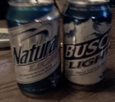
Natty Light redesigned its can last summer. Within the last month, the new Busch Light cans started showing up in my 30 packs. The result is unacceptable.
These cans are way too similar. The fonts are all set at the exact same angle, the amount of blue exposed at the top is almost identical, and they both taste like crappy beer. I’ve already had a few nights where I grabbed for someone else’s Busch when I was drinking Natty.
Worst of all, both beers are made by the same company. Could Anheuser-Busch use this packaging deception as a way to phase out Natty Light?
Connoisseurs of crap beer won’t sit for any of this.
